Multiplayer Views
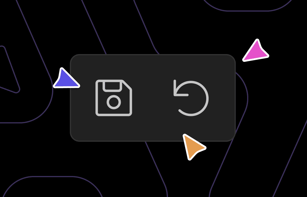
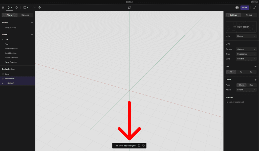
While it is very important to be able to save views for documentation, most of your time in Arcol is spent modeling in non-default view orientations. This means that the view save/reset buttons are essentially always visible, and having them displayed front and center gets annoying very quickly.
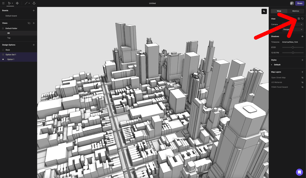
V2- Buttons in right sidebar
I couldn’t dig back far enough to get a screenshot of the old UI so this is a re-creation, but I believe this was where our view buttons were when we did our preview release in August of 2023. This design had the opposite problem of the first - nobody noticed it. The design is also based on the View tab being the default tab in the right sidebar; we very quickly made Metrics the default tab since that is what is most important to reference while modeling. So, on we went to V3.
V3 - Show indicator beside view name
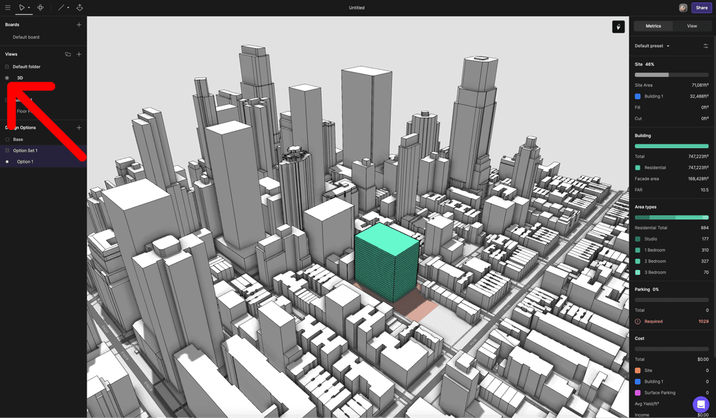
A big reason why nobody noticed the buttons in V2 was their placement - buttons appearing in a section header on the right amidst a bunch of other inputs and text was too hidden. The contrast between buttons vs no buttons just wasn’t enough. This design moved the buttons to a context menu (where you also do other common actions like renaming or deleting a view) and opted for a yellow ring to indicate that a view has changed. There were a few problems with this design:
The yellow ring was too small to be very noticeable. At that point we used the dot to indicate which view you were in, so that addition of a small yellow ring around the dot was too subtle.
We showed a tooltip when hovering the yellow ring, but it wasn’t obvious what the ring meant.
We intend to allow multiple views to be changed without being saved, allowing a user have their own “working views” in a session. This would mean showing a yellow ring beside multiple view names…which wouldn’t look great.
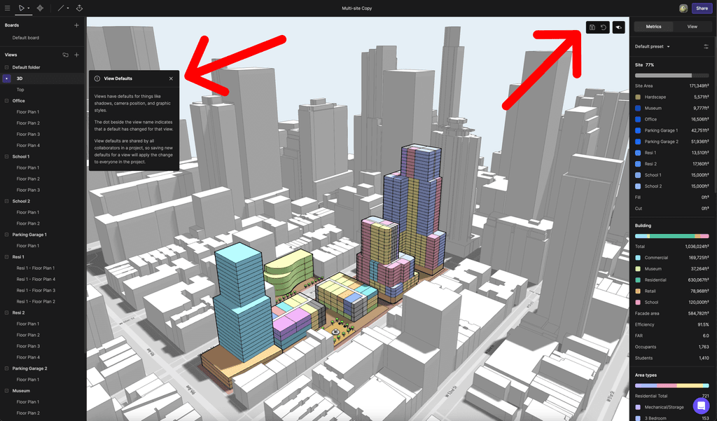
V4 - Show buttons in top right of canvas
This is the current design for view buttons in Arcol. Here’s why we like it (so far):
Easily discoverable, but out of the way → The buttons now show in the top right of the canvas, which puts it closer to actions that affect views like shadows, graphic styles, and label visibility. The buttons are still almost always visible but they don’t feel too obtrusive because they’re tucked in a corner with the North arrow, and because they’re on the canvas they’re very easy to spot.
Better tooltip → We changed the selection UI for views in the left sidebar list from the dot to a background color change. Now the dot is used to further indicate that a view has changed (in addition to showing the buttons), and when you click on the dot a tooltip is show explaining how views work. The dot also has hover and click visuals like an actual button, which feels better than just always showing a tooltip on hover.
Scalable → Changing the selection UI also sets us up for having dots shown on multiple views that have changed, which can act like a notification on views you are not currently in. The small unlock here was adjusting from the dot indicating that a view is active to the dot indicating that a view has been changed.
Final thoughts
Model views matter! Multiplayer matters! At Arcol we think about this stuff constantly and obsessively. Sometimes we get things feeling good on the first time around, but most features require multiple iterations. Stay tuned for V5/6/7/… of our view save/reset buttons. What do you think of V4? How could it be better? Drop us a comment, we’d love your feedback.
If you’d like to give Arcol a try, head to arcol.io/demo to book a demo.
— Mike + the Arcol team

